Logo design or brand identity design is an extensive and creative process itself. Many people think like, “oh, this is looking like a too simple job,” but in reality, logo design is a very creative and time-consuming process. Being in the logo and branding industry for the last three years and making hundreds of brand’s visual identities, we are giving you the top 7 tips about logo design. After reading this, you will come to understand how you should design a logo with perfection.
1. Read Client’s Brief Before Logo Designing.

Many people start to hurry when they receive any order from their clients, here comes the biggest mistake of a design process. If you are not reading and understanding the brief of your client, then trust me, “they will expect something else and you will end up with something else, and then they will not pay you the rest of the 50%.” The client’s brief is something that you need to understand appropriately before opening your drawing pad.
2. Pencil Is Mightier Than The Mouse In Logo Design.
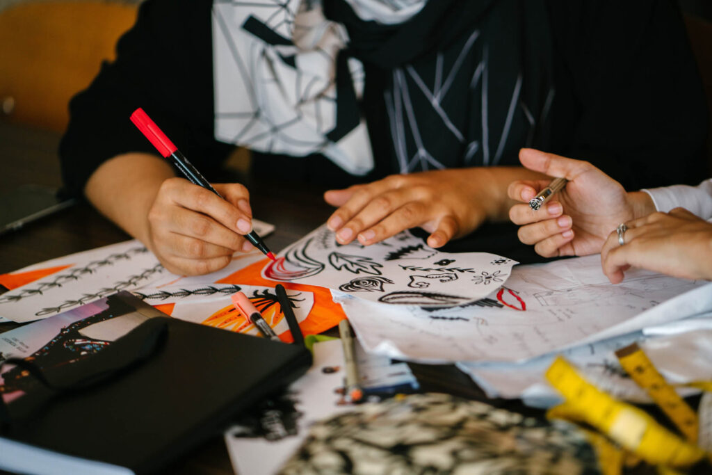
Yes, as it sounds, a pencil is a hundred times more important than a mouse and illustrator in the design process. At the very first stage, open your drawing pad and get a sharp pencil to start thinking. I never open illustrator at first; I have seen many guys make that mistake. They receive the project brief and begin to draw in illustrator. Never copy this mistake; if you start to design the illustrator’s Logo at the first stage, then there are 99% chances that you will end up making something other than the client’s brief. Also, the work will not be perfect and satisfying.
While thinking, remember those key points.
– Read the Client’s brief several times until you understand everything; even you can question your client again if you have any blurriness about the brief in your head.
– don’t try to copy from google; never make this mistake if you don’t want to fire your future.
– Think about how the logo elements can connect the client’s expectations and the brief they given.
3. Target Audience Research Before Starting The Logo Design.

I can remember when I was starting up. I never invested time to understand what the target audience is. Now I know this is an essential
part of a brand identity design process. Do you need to understand correctly who the target market of your clients is? Maybe they are just kids, job owners or gym freaks, tech lovers, or makeup lovers. You need to understand every human being’s simple psychology. E.g., If the target audience is kids, then never use the dark black corporate colors or very sharp edges in the Logo, make something related to them, connecting the client with their target audience list.
4. Research About The Market.

You need to research other competitors of your client’s business, too; in the research process, you will understand many other things like what they are doing? What type of graphics are they using in their Instagram or LinkedIn profile? And so much. This research process will come up with hundreds of new ideas about the logo concept and the graphics guidelines.
5. Typography Of The Final Logo
One thing you must remember, Logo or brand identity mark is not everything. You need to invest some creative time in typography too, and not every typeface is for every business. You need to understand what type of typefaces will connect the brand to their target clients better and then go for the Logo typography. You can also go to some free fonts website and check how the Logo name there and see how this will look like in various font styles, then download the final one. But keep this thing in mind, before going to those websites, think about the typefaces that will represent the brand in a better way to their target clients.
6. Check The Size And Visibility Of The Logo
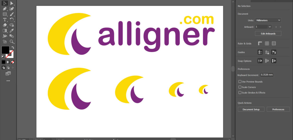
Before exporting the project, zoom out the illustrator screen and see if the Logo is still visible or not. If this is not visible, start the project again (if this is not a mascot logo).
As a creative designer, you must remember that the Logo will be used as an app icon or a web favicon or in a pocket-size business card too. So always make it correctly so that this will be visible in every size format. And don’t over-design this. Please keep it simple, meaningful, and mainly easy to remember.
7. Presentation mockups On The Logo Design
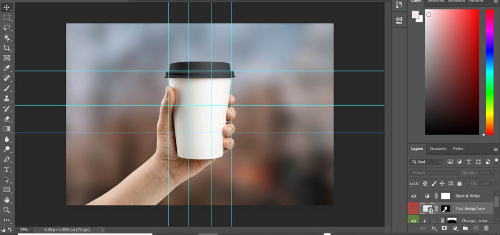
I hope now you understood that how to design the total Logo properly, but here comes a simple but critical stage in logo designing, MOCKUPS; yes, never send the Logo in standard jpeg or standard png file to the client for approval; you need to understand how to present the design to your client for approval, use some real-life mockups in photoshop for the Logo, you can find out millions of free mockups online, download them and put your logo design over real-life things and see how the Logo will appear in real-life situations. E.g., Logo over a business card, Logo over a t-shirt, over a bag pack, over a pen, pencil, coffee mug, or anything, and then make a proper presentation pdf file for the client. After that, send the file to the client for approval or some future revisions.

