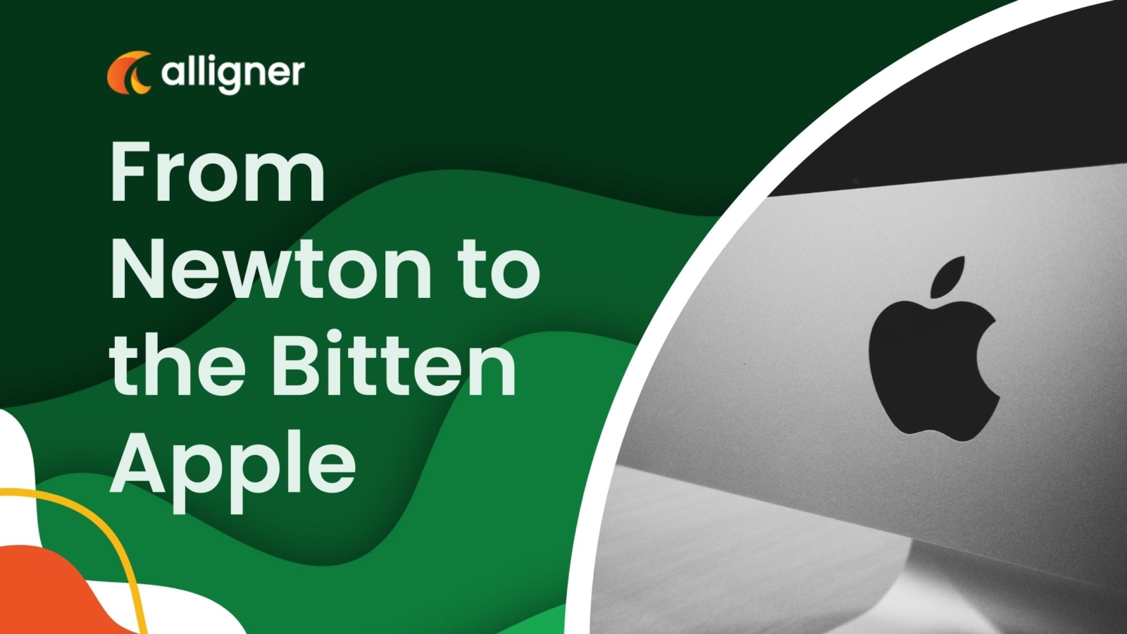
The iconic Apple logo is recognized worldwide, but have you ever wondered about the story behind it? From its humble beginnings to its evolution into the sleek and simple design we know today, the Apple logo has a rich history that is deeply intertwined with the company’s founder, Steve Jobs, and its rise to technological dominance. In this blog post, we will take a deep dive into the fascinating journey of the Apple logo, exploring its origins, the inspiration behind its design, and the meaning it holds for the brand. Join us as we unravel the captivating history behind the bitten apple logo and discover the secrets it holds.
1. The Origins of the Apple Logo
The iconic Apple logo is instantly recognizable, but do you know the story behind its creation? The origins of the Apple logo can be traced back to the early days of the company, when founders Steve Jobs, Steve Wozniak, and Ronald Wayne were brainstorming ideas for a logo that would represent their innovative brand. The first logo, designed by Ronald Wayne in 1976, depicted Sir Isaac Newton sitting under an apple tree, with a quote from William Wordsworth encircling the image. This logo symbolized the company’s pursuit of knowledge and the inspiration that can come from a moment of insight, just like Newton’s famous apple falling from a tree. However, this intricate logo was short-lived. Jobs found it too complex and decided to look for a simpler alternative. This led him to enlist the help of graphic designer Rob Janoff to create a new logo that was clean, recognizable, and could be easily reproduced at any size. Janoff’s design, introduced in 1977, featured a rainbow-colored apple with a bite taken out of it. This colorful logo was a departure from the monochromatic logos commonly used at the time and reflected the vibrant and creative spirit of Apple. Over the years, the logo underwent several revisions. In 1998, Apple introduced a new, sleeker version of the logo, known as the “glass” or “Aqua” design, which complemented the company’s evolving product line and design philosophy. Today, the logo has been further simplified into a clean, silver silhouette, but the iconic shape and bite mark remain unchanged. The Apple logo has become synonymous with innovation, quality, and cutting-edge technology, making it one of the most recognizable and influential logos in the world. Unraveling the history behind the Apple logo gives us a fascinating glimpse into the evolution of the company and the values it has held from its early days to the present. It serves as a reminder of the power of a simple yet memorable logo to capture the essence of a brand and leave a lasting impression on the world.
2. Evolution of the Apple Logo
The evolution of the Apple logo is a fascinating journey that reflects the growth and transformation of one of the world’s most iconic technology companies. The first Apple logo, designed by co-founder Ronald Wayne, featured an intricate illustration of Sir Isaac Newton sitting under an apple tree. This logo symbolized the company’s commitment to innovation and discovery, drawing inspiration from Newton’s famous encounter with the falling apple that led to his theory of gravity. However, this intricate logo was short-lived, as Steve Jobs and Steve Wozniak quickly realized the need for a simpler, more streamlined design. They hired Rob Janoff, a graphic designer, to create a new logo that would be easily recognizable and scalable. And thus, the famous rainbow-colored Apple logo was born. Introduced in 1977, the rainbow logo featured six colorful stripes, evoking a sense of creativity and diversity. Each color represented a different facet of Apple’s products and vision – blue for innovation, yellow for happiness, green for growth, and so on. This vibrant logo became synonymous with Apple’s brand identity during the early years, adorning their products and marketing materials. As Apple’s product line expanded and the company underwent significant changes, the logo underwent its own transformation. In 1998, Apple introduced the “bitten apple” logo, which is still in use today. The bitten apple, with a single bite taken out of it, has become an instantly recognizable symbol of Apple’s sleek and minimalist design aesthetic. The evolution of the Apple logo reflects the company’s journey from its humble beginnings to its current status as a global technology powerhouse. Each iteration of the logo captures a different chapter in Apple’s history, showcasing its commitment to innovation, simplicity, and user-friendly design. Whether it’s the iconic rainbow logo or the sleek bitten apple, the Apple logo continues to be a powerful symbol that resonates with consumers worldwide.
3. The Inspiration Behind the Design
The iconic Apple logo is instantly recognizable and has become a symbol of innovation and creativity. But have you ever wondered about the history and inspiration behind this famous logo? Let’s take a journey back in time to unravel the story. The inspiration for the Apple logo can be traced back to one of history’s most famous scientists – Sir Isaac Newton. Newton’s groundbreaking discovery of gravity is represented by an apple falling from a tree. This significant event served as the foundation for the logo’s design. However, the story doesn’t end there. In 1976, when Apple Inc. was founded by Steve Jobs, Steve Wozniak, and Ronald Wayne, they needed a logo that would embody their vision of revolutionizing the technology industry. Rob Janoff, the talented graphic designer hired to create the logo, took the concept of Newton’s apple and gave it a modern twist. The apple was chosen to represent knowledge, creativity, and taking a bite out of the forbidden fruit – in this case, challenging the status quo. The colorful rainbow stripes adorning the apple were a reflection of the vibrant and innovative spirit of Apple Inc. during its early years. It stood for diversity, inclusivity, and a departure from the monotonous grayscale world of traditional computers. Over the years, the logo has seen some subtle changes, with the rainbow stripes eventually being streamlined into a sleek monochrome design. This evolution aligns with Apple’s own transformation into a global tech giant, while still holding onto the core values of innovation and simplicity. The Apple logo has become an iconic symbol that transcends the company itself, representing the power of imagination, pushing boundaries, and changing the world through technology. In conclusion, the Apple logo draws inspiration from Sir Isaac Newton’s discovery and reflects the company’s commitment to innovation and challenging the norms. Its evolution mirrors the growth and success of Apple Inc. itself, making it a timeless emblem of technological excellence.
4. The Meaning and Symbolism of the Bitten Apple
The bitten apple is one of the most iconic logos in the world, instantly recognizable as the symbol of one of the most innovative and influential companies in history: Apple Inc. But what is the meaning behind this distinctive logo? The story of the bitten apple logo begins with a nod to scientific genius Sir Isaac Newton.

According to legend, Newton was sitting under an apple tree when an apple fell on his head, inspiring his groundbreaking theory of gravity. This story is often linked to Apple’s logo, as it symbolizes creativity, discovery, and the pursuit of knowledge. However, the bitten apple logo has a deeper meaning beyond the Newtonian connection. It was designed by Rob Janoff in 1977, and he has explained that the bite in the apple was added to ensure that people would recognize it as an apple and not a cherry or any other fruit. The bite also adds a playful touch, making the logo more memorable and distinctive. Over the years, many interpretations of the bitten apple logo have emerged. Some see the bite as a reference to the biblical story of Adam and Eve, representing the knowledge gained through taking a bite from the forbidden fruit. Others view it as a symbol of the complexities and challenges of technology, with the bite representing the inevitable imperfections and vulnerabilities that come with innovation. Regardless of the various interpretations, one thing is clear: the bitten apple logo has become an enduring symbol of Apple’s brand identity. It represents innovation, simplicity, and a commitment to pushing the boundaries of technology. It has become a visual shorthand for the company’s ethos and the revolutionary products it has brought to the world. In conclusion, the bitten apple logo is more than just a simple design. It carries with it a rich history, a range of interpretations, and a powerful symbolism that reflects the values and aspirations of Apple. It is a symbol of the company’s past, present, and future, and a testament to the transformative power of ideas.
——————————
Add a Comment